The T H WHITE Brand Evolution
The Brief
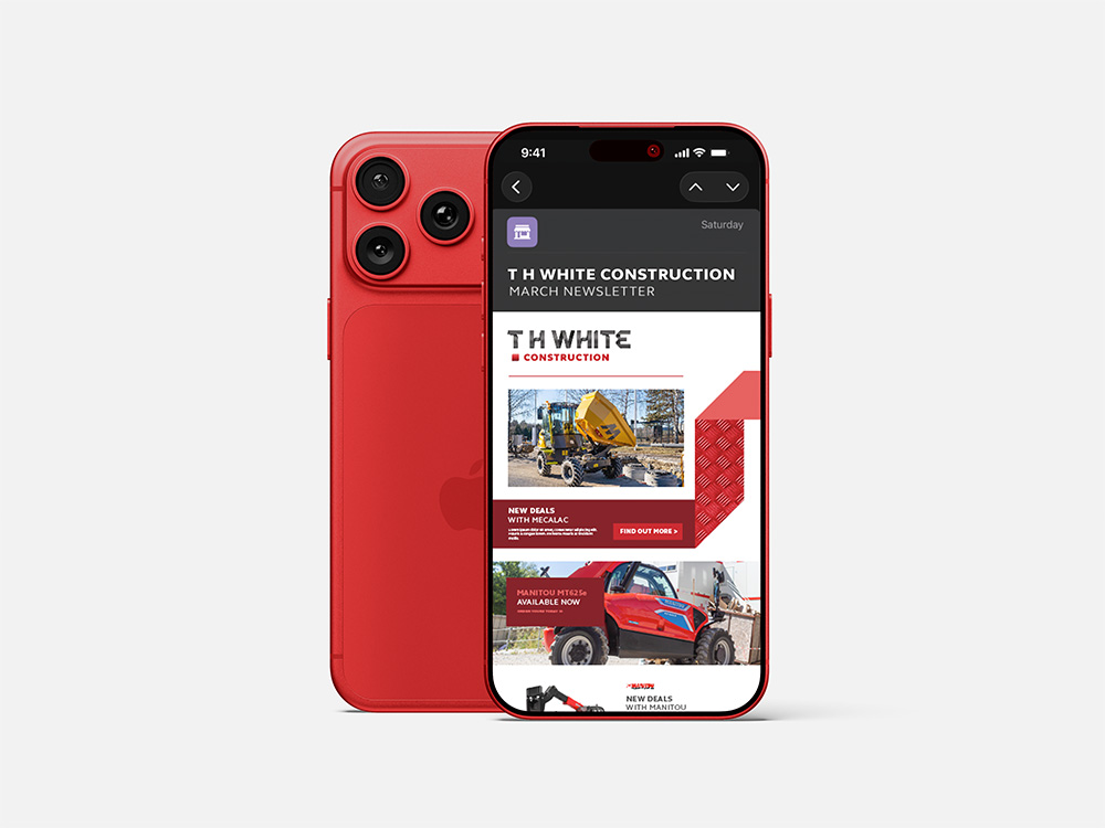
Founded in 1832, T H WHITE is an engineering powerhouse operating from 18 depots with over 500 employees and a turnover exceeding £100 million. Rapid multi-divisional expansion had led to visual fragmentation. The group needed a Brand Evolution to unify four core divisions; Agriculture, Construction, Dairy, and Groundcare, under a new “T H WHITE Machinery” umbrella identity, while allowing remaining divisions to operate independently with group-wide visual cohesion. Crucially, the new architecture had to engage tech-savvy “New Gen” farm managers and contractors without alienating clients who trust the company’s 190-year heritage.
The Hurdles
- The Heritage Paradox
Modernising the aesthetic for mobile-first audiences without losing the grit and authority of a historic engineering firm. - Global Co-Branding
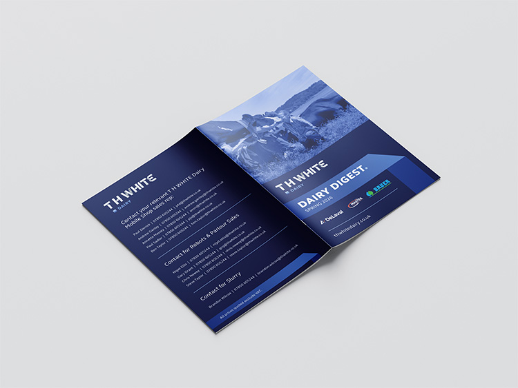
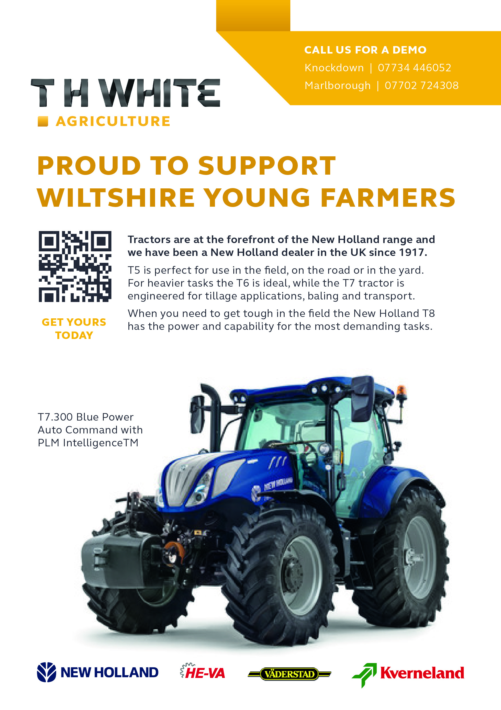
Designing an independent visual architecture strong enough to house global partner logos (New Holland, Manitou, DeLaval) without diluting T H WHITE’s own brand equity. - Machine to Human
Introducing warmth and human character to a traditionally sterile, product-led category.
Our Approach
- Divisional Marker System
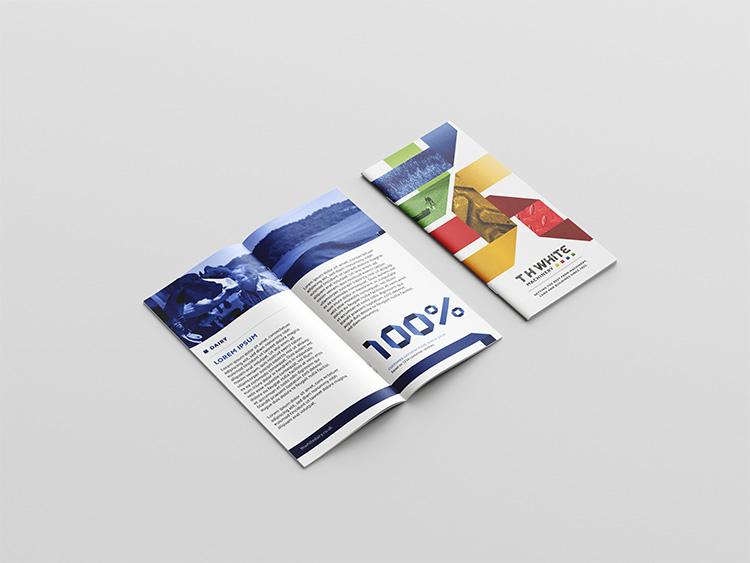
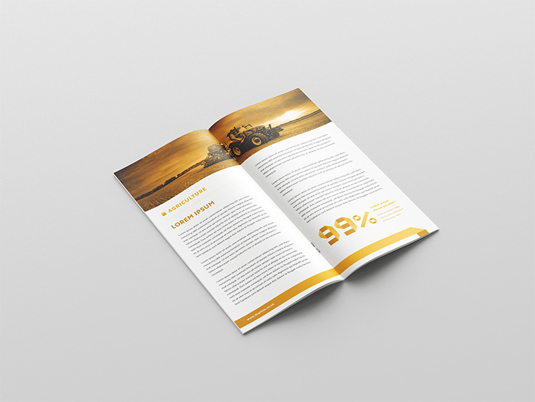
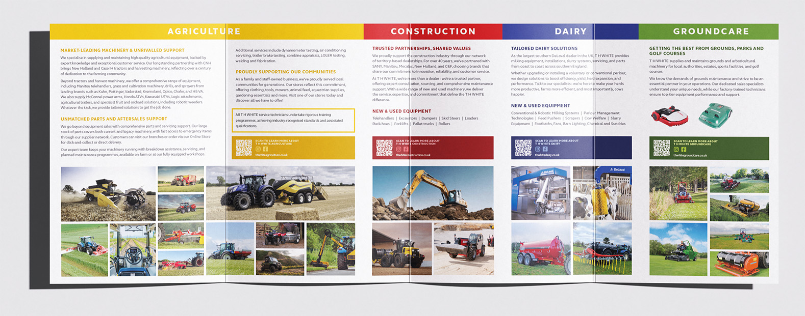
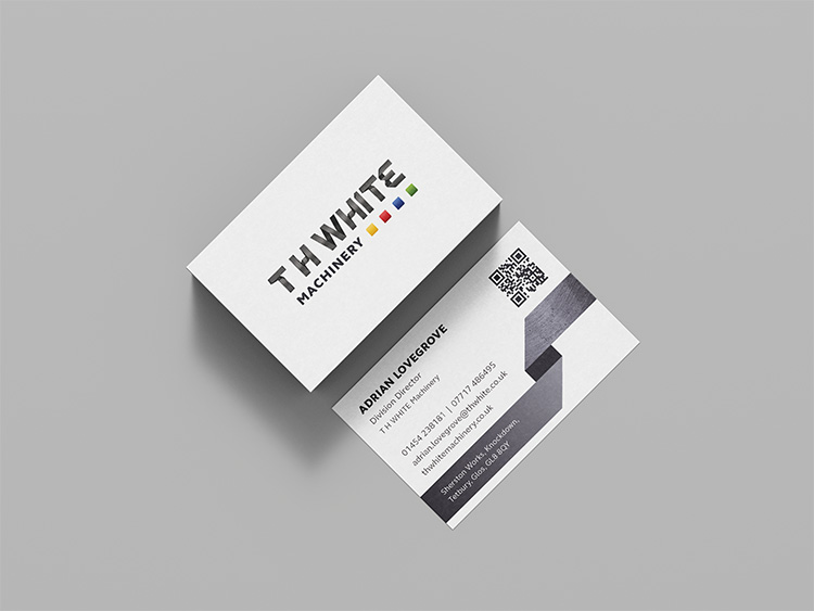
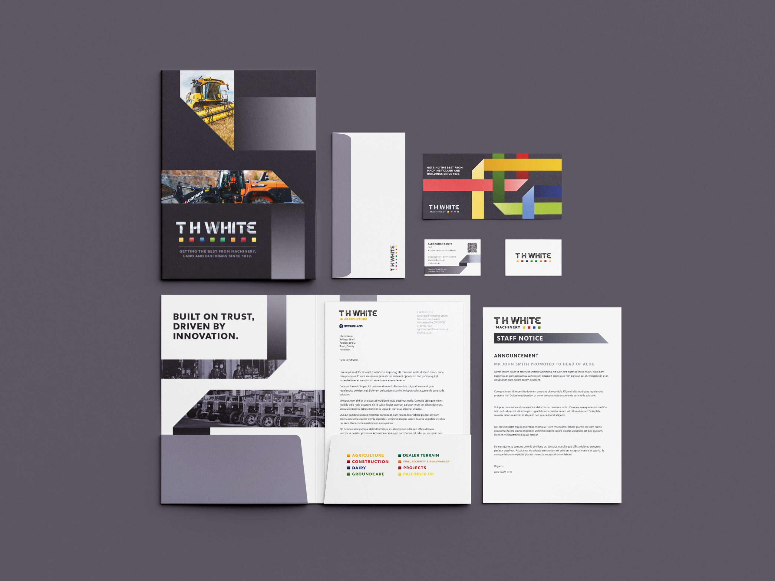
Introduced a distinct colour palette and square marker for each division, establishing a clear visual hierarchy that reinforces T H WHITE’s identity as a multi-disciplinary business. - Elevating the Visual Core
Streamlined the brand’s synonymous “folded metal” device. We retained its decade-long equity but resolved its previously clunky application with refined textures, modern gradients, and strict design rules for a highly elevated look. - Comprehensive Artworking Guide
Built an in-depth Brand Guideline designed specifically for T H WHITE’s internal resources. Recognising that the brand is managed by teams with varying levels of design experience, we went beyond high-level principles to provide a granular, step-by-step implementation manual.
The Work Delivered
Silverless delivered an evolved logo suite, colour palette, and a comprehensive Master Brand Guideline, equipping internal teams and external partners to implement the new identity confidently and to its full potential.
The Result
T H WHITE now operates with a modern, agile visual system that respects its 1832 roots. By bringing warmth and structural clarity to a complex engineering group, the brand speaks confidently to the next generation of farmers and contractors.
Brand
Brand Strategy
Design
INSPIRED BY THIS PROJECT?
Then get in contact with us to chat about working together on a similar project for your business.
Contact Us